The famous quote: "Design is not the way it looks but the way it works." was coined by none other than Steve Jobs. Jobs, was a pioneer in the field of design and technology. You can tell an Apple Product apart from any other product simply because of their design, not only the one that is visible.
If you would see how the Apple interface works, a particular set of functionality is noticeable. The minimal outlook of Apple products is universally acclaimed—but now it seems boring to people. Not much has changed, design-wise since the i-phone 5 and that is hampering Apple's growth. They have to bring something new to the table.
Design is a trial and error case. What's scary is, even if you play by the rules, there is a 50% chance that it might not work, because of the over-saturation of products which follow the same rule book that you plan to follow. Think about T-Mobile. They chose to go with a Bright Fuchsia for the company, which catches people's attention very easily, so much so that whenever you see that bright fuchsia, you are bound to think about T-Mobile.
Same goes for logos, take the example of FedEx, it's unique combination of Purple and Orange definitely strikes the eyes, but if you take a closer look, you can see and arrow between E and X, signifying the efficiency and speed executed by their company.
Logos build a link between you and your customers by sticking to your customer's minds. Take a look at some of the creative logos over here. Continue to read on if you would like to know more about the various functionalities of design other than just aesthetic value:
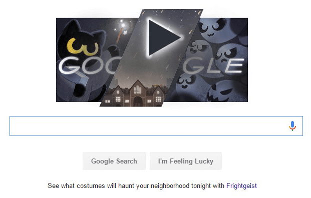
Using A Good Style Guide: A style guide is a set of rules that one may refer to while creating a website. One gets a better understanding of color schemes, fonts, do and don'ts. Style guides can be utilitarian to stick to a theme that a team can follow. It gives uniformity, clarity, a strong foundation and understanding about what is really going on. Adding more elements to a theme is always possible. Check out google's through and well-written style-guide.
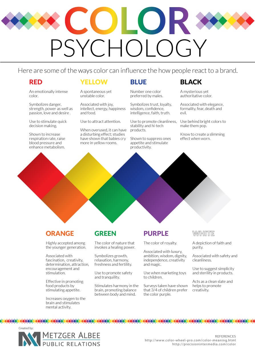
Color Schemes: The colors used in your website speak for themselves. Colors have the power to influence people's moods and behaviours. Don't believe us? Take a look for yourself in this chart.
Source: Metzger Albee Public Relations.
Makes sense? Let us be the Picasso's and create a masterpiece of your website.
-
Typography: The other aspect controlling the mood of your clients is the font that is being used. Here is how it works.
The size of the font is vital to keep in mind. Smaller fonts are associated with a feeling of distrust and makes it look like you are hiding something. (Think of fine-print used for disclaimers etc) The more clearly visible font, the better the chance of you gaining more clients to work with.
The style of the font is the second aspect. Once the style is picked, the accents, Bold for emphasis. Italic for movement, Underline for necessity.
Remember, your need to have a website that works well on mobile platforms as well. Take a look at some of these typefaces to see what would fit your website best.
Design Elements: Some elements of a website are Sidebars, Banner Ads, Buttons etc. Think of sidebars and banner ads—do you really need them? You might want to think that over after seeing this heat-map here. A human-eye which has been used to Internet for quite a bit tends to overlook a lot of information. (Read more in our previous blog post here) You want to give their eyes a break. Keeping ample amounts of negative/white space is not a waste of space, but a way to convey your message to your clients clearly and much more effectively. Spaces devoid of any sort of information or design elements smooths things out on your website. Also, it lets your client focus on the products/services your business can provide to them much better.
-
Simple Navigation: A simplified navigation system comes as a blessing to your clients. Some aspects of simple navigation include:
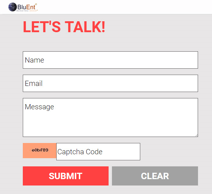
Contact Information: When a customer is going through your website, they should not be struggling to find your contact information. The contact us button should be visible on your landing page. Example:
Example of contact information. source: BluEnt.
Bigger Buttons: If you choose to use buttons, make sure they're visible and load fast on mobile platforms. Buttons make it easier for you to be able to track whether or not they were interested in knowing more about your business in general.
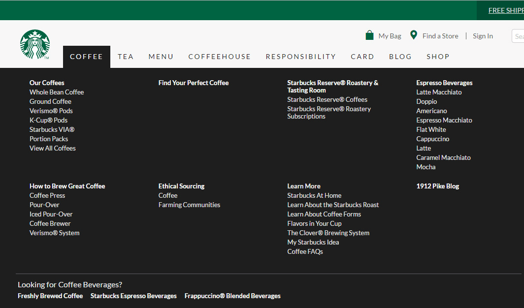
Content Organization: Drop-down menus and stuffing the left sidebar on your website with information is dead and the work especially bad on mobile platforms. If your business however has way too much content, implement a mega drop down menu like this one:
Search Bar: A search bar lets your customers find information without having to go through large menu options.
Is the website of your business implementing all of the above? Think you might be lacking in some areas? Join forces with our website designers at BluEnt.
Maximum Value, Achieved.





 How Much Does App Development Cost? A Budget Estimation Guide
  Using Angular to Develop Mobile Apps Can Be a Game Changer for Your Business
  Pros and Cons of the WooCommerce Plugin for Online Merchants
  Mean Stack vs LAMP Stack: Which One is Better for Your Business?